Archive
Printmaking Was the Original Photography

Jan Lievens etching by Lucas Emil Vorsterman (1530 to 1545). An almost 500 year old selfie.

I had long thought of painting as “what we had before photography” but have revised the idea that photography replaced painting as it replaced printmaking much more. I now realize that printmaking fulfilled the functions of modern photography much more closely. A painting catches our attention for being in color but it is only a single object. Printmaking does the two things photography excels at: it creates multiples through mechanical reproduction.
There is a nice exhibit right now at the Museum of the Art Institute of Dutch, Flemish and Netherlandish portrait etchings from the 15th and early 16th Centuries. Selfies are not new at all; they are just now easy for a huge number of people to make and distribute. One placard in the exhibit stated that the portraits not only confirmed fame, they could also create it. Sound familiar to you?
Seeing so many etching portraits made for circulation made me feel that people of this time period would have loved social media just as much as we do now if they had it. In a way, they did have social media, it was a lot slower. Getting picture out took a great deal of skill, time and paper.
Century Old Die Cut Card


This century old die cut card is also an embossed stone lithograph print. I bet it cost a few pennies extra when it was sold! Notice how the artist managed to curve the text to follow the shape of the note card in the design of the greeting card. Here is a 300 dpi high resolution scan JPG for you to print for collage or use in a digital design.
How to print leaves onto quilting fabric

This baby quilt is a project where I combined printmaking skills with hand quilting. Leaves make a nice pattern. Better yet, leaves are free! This is an easy process that you can do in an afternoon.
Product Review: Staedtler Master Carve Block


I had tried a few different kinds of soft carve media blocks as an alternative to linoleum. I did not like any of them! The prior brands were easy to carve but were not good for fine lines -or even clear lines- as the edges would cut raggedly or crumble. I carved the blocks as soon as I bought them, in case the soft media blocks can dry out and harden with time like linoleum. Then I tried a Staedtler Master Carve block and it was totally different, holding fine, clear lines like linoleum while being as easy to carve as a pencil eraser. I am so hooked on this product!
This is the carving I did with the block. I used Dockyard Microtools 1 – 2 mm V and U gouges to do the carving. I wanted the pattern of the cat to be hair-like and to also have cuts in the block delineate the fur. I also like carving with gouges a lot, seeing the line appear in one cut as it curls away from the block. Sharpie marker is helpful to get the design on the Staedtler block so it can be carved; once the ink was dry it did not smudge or wipe off.

Carved block before printing.
I was thrilled with how smooth and easy the gouges cut through the block. This media would be great to carve with an Xacto knife or any other block print cutting tools. I carved the background around the cat because I wanted to print the noise and have that as a comparison to the positive image.

I used my preference of an oil-based intaglio ink to print. Oil-based ink takes longer to dry but does not smudge and has a richer, deeper color. Both the positive design and the background noise printed wonderfully with the Staedtler Master Carve block. I used an Asian paper with some mulberry tree fibers and shiny silver flecks in each sheet for printing. The final print on this paper is very lovely. It makes me feel like a cozy cat is curled up on a snowy day so I titled this piece “Winter”.
Vintage Bird, Hawk and Owl Etchings
Here are some vintage to antique etchings scanned from an old magazine which I cleaned up in Photoshop for you to use. All are 300 dpi high contrast black & white images. The adorable owls are my favorite!
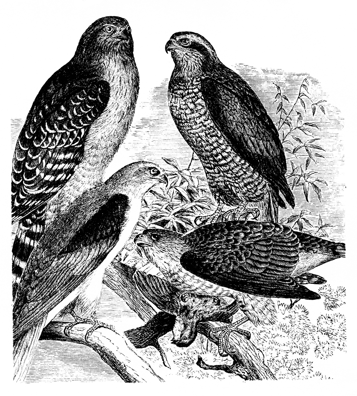
Some kind of hawk family, species unknown.
Important Tips on Using Gelli Arts Gelli Monoprinting Plate
 I have been playing around with a rubbery gel monoprinting plate by Gelli Arts. I learned you cannot use inks with the plate. It is a fun tool for monoprinting by hand, especially for making your own decorative papers. These are the details I have learned so far:
- Stay with acrylic media! The fine particles of watercolour paints and inks are absorbed by the Gelli plate. I used Speedball water-based block printing ink, and it stained the plate very deeply. Using dish liquid detergent and alcohol hand sanitizer gel did not lift the stains. The instructions say to avoid dyes and fabric dyes but do not mention inks specifically. Many inks are acrylic based; it seems natural media that has gum Arabic or fine colorants work their way into the plate. The pigment or colorant in watercolours, inks and dyes seem fine enough to be absorbed by the Gelli plate. I thought the plate was non-porous sheet of silicone rubber. This is not the case. Some of the inks that caused the staining also came out when I was using it later and blended in with the acrylic paints I was printing.
- A drying rack is a huge help. Use a line to hang prints if you have to. I have enjoyed working where there is a drying rack so I can print, let the paper dry and go back to print further layers or color.
- The surface of the Gelli plate is very sensitive. Use a very soft sponge or a piece of t-shirt fabric if you need to rub off dry paint. Even standard paper towels seem to be really rough and leave marks on the surface. Keep the packaging material so you can store your Gelli plate without it getting dented or scratched.
I am having a lot of fun with this tool. I just ran into a learning curve on what I can do and cannot do with it, and some concerns on how to properly maintain my new toy. If you have learned anything interesting, please respond in the comments area.
Book Recommendation: Printmaking in America: Collaborative Prints and Presses 1960 – 1990

Printmaking in America: Collaborative Prints and Presses 1960 – 1990 (editor Elaine M. Stainton, 1995) is an exhibition catalog with a highly detailed history of printmaking from as far back as the 18th Century and the revival of artistic printmaking through specific efforts and studios from 1960 onward. Many studios and presses throughout the USA are named and have their specific histories chronicled. The fine art market for prints during this time, the role of foundations and universities in creating studios, and how various studios lead to the creation of others across the nation are all interesting aspects of this history. The prints included are a collection from many well recognized contemporary artists. Some favorites of mine were from Ed Ruscha, Barbara Kruger, Robert Longo, Chuck Close, Helen Frankenthaler and David Hockney. If you geek out on printmaking, definitely read this book cover to cover.
I Joined a 20:20 Blind ATC Swap

Artist trading card inventor m. vanci stirnemann lists active trades on his website and I joined a 20:20 trade, sending in linocuts of a large edition I just completed. I took a quick camera phone photo of a cute vintage VW convertible last summer and saved it for a linocut. The ATC trade I joined, named “Sister Trading Cards”, is for women and the host put the details as:
project! for women! ladies! chicks! girls!
SISTER TRADING CARDS – the all-girl trading card set
make and send 20 ATCs – any theme – no deadline
you’ll get a set (including your own card) backsend 20 ATCs (20 different ones or 20 times the same)
size 2 ½ x 3 ½ inches (64 mm x 89 mm)
sign, number and date on the back of the card
no theme, all techniques
no deadline
you will get a set backsend it to:
STC c/o Cat Schick
246 23rd Ave. NW
Calgary, AB
T2M 1S2
Canadae-mail: s-chick@bluewin.ch
If you get another participant’s e-mail address, please don’t add it to your general address book as that person might not want to be on any mailing lists. Thank-you.
I have plenty more of this ATC to trade. Please send an email if you want to swap!
Picasso’s “Rinsed Print”

Jacqueline by Pablo Picasso, linocut, 1959
I love the simple but brilliant technical execution of this piece. The image has a nice smoky bluish color most like the above photograph. Referred to in the museum exhibition as a “rinsed print”, the steps are wonderfully simple. The uncut block was printed onto the page in a solid filed of black. Then the lines were cut for the drawing; the lines of the portrait were cut into the same block which was inked in a layer of transparent white and printed onto the solid black field. The black had a bluish tinge, which resulted in the final colour of the print.
The ease of this technique is that there is less cutting of the block. You only have to actually cut the lines away that you want to show as a positive, instead of doing the reverse and cutting away all of the negative space to expose the lines of the image. You have to print the page twice to make this work but the effect of the more transparent, glaze-like second ink is visually interesting.

Engraver’s Etchings Collection
I lucked into a collection of fifteen small intaglio etchings that I was able to afford. I believe they were from proof sheets that were on file with a printer, probably a Chicago publishing house, and the sheets were cut apart to be sold by the piece in the antiques shop I purchased them from. The engraver’s artwork in these pieces is simply wonderful. They are a delight to hold in the palm of my hand and look at. I am sharing these with the usual 300 dpi level scans for your use and enjoyment. Absolutely go to the bottom and see the Neo-Classical post Great Chicago Fire illustration which I have included last. I take delight in that one as a physical piece of history along with the engraving with a personification of electricity!

This engraving was stolen from The Horse Fair by Rosa Bonheur (1853). I think it was worked up from a photograph of the painting. It may have been made to show the engraver’s skill or maybe he liked the painting to much to resist copying. Then again, I’m always painting photographs I like, so who am I to criticize? ☺ I recognized the source it was taken from right away and had to have it.
